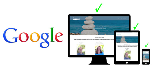
Why Responsive Design?
In 2018, mobile phones generated 52.2 percent of all website traffic worldwide, up from 50.3 percent in the previous year. In the USA traffic was at 42.8 percent in 2018. (Source) The question is no longer when will your site be viewed on mobile devices but how will your site be viewed on mobile devices.
What’s the difference between mobile-friendly, mobile-optimized and responsive design?
Mobile-friendly: Good
Mobile-friendly websites display content adequately on desktop or laptop computers, tablets or smartphones. A mobile-friendly design basically does just the bare minimum needed to avoid major usability problems. A typical example is a 2-column (e.g. sidebar) layout where the 2nd column drops down when there’s not enough room to show it side-by-side with the first column, and starts compressing images so that a user doesn’t need to scroll horizontally to see everything on a page.
Mobile-optimized: Better
The next level is mobile-optimized sites, where formats, layouts, button sizes, images sizes, etc. change as needed to compensate for the varying screen widths of handheld or tablet devices. Mobile-optimized websites aim to be even more frictionless or mobile users. Typically navigation buttons are larger (allowing for a range of fingertip sizes), reformatted content appears, but there may be some screen width ranges where users have a less than optimal experience interacting with the site
Responsive Design: Best
Responsive website design architecture ensures that the desired content can be easily found, seen, and interacted with, regardless of the device. If a mobile user has to scroll horizontally as well as vertically, or images are chopped off or too tiny to be seen, if fonts are too small to read or buttons and links are too small or too close together, or if the navigation just doesn’t work, visitors will leave the site on their mobile device. They don’t want that and neither do you. Neither does Google; that’s why they now give significant prioritization for sites that avoid these problems. Responsive web themes that factor in the full range of screen widths, look great and perform well regardless of the device or screen width or orientation make this process easy. This is where we begin.
Built-in Responsive Design
We only design sites using themes with mobile responsive design built in. That way we don’t have to “re-invent the wheel” and instead can focus on what we do best – showing the world your products and services in the best possible light. Bypassing the process of testing the initial layout on a wide range of device widths, we can jump right in and work with your content, as the robust yet adaptable foundation – the mobile-responsive theme – is already in place.
Is your current theme mobile-responsive?
If not, it is time for your website to get a fresh new look making it mobile-responsive. At the same time, we’ll make your site faster, more secure and perform better with search engines – more SEO-friendly! Mobile-responsiveness is just one of the many factors that Google now ranks sites on, and we cross that one off the list from the get-go!
Better access and visibility means more traffic to your website, added conversions and increased sales.
Benefits of Responsive Design
Better Search (SEO) Performance
If your site doesn’t appear in search results, it’s unlikely you’ll attain optimum benefits from your site. A responsive, mobile-optimized site doesn’t guarantee search engine success, but it eliminates one of the important barriers to it.
Improved site usability
Users that can’t quickly and easily navigate your website and find what they’re looking for will often abandon the site and look elsewhere. We have decades of experience delivering content in an organized and easily accessible way and our themes with built-in responsive design make this easy.
Faster Page Load Speed
Google includes the time it takes to load each page of your website in their assessments when indexing and ranking sites. IDS tests your new responsive site and page loading speeds and makes sure your site is loading at its fastest rate by ensuring content, design, and images are responsive and mobile friendly, as well as optimizing other “under the hood” items.
Google strongly encourages and rewards a responsive web design.
Google encompasses 67% of the market share; When Google speaks, search markets listen. Google refers to responsive web design as industry best practice.


