Website Update for International Publisher
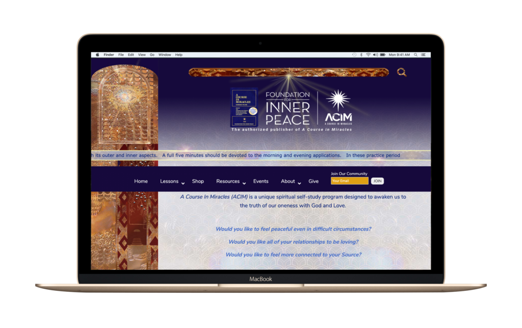
The Foundation for Inner Peace wanted a complete design transformation of their large site in parallel with a total technological upgrade from a static, dated “early days of the web” platform to a modern, extendable, scalable, secure, high-performing one. This multi-year project required careful coordination and planning from team members in Europe, Latin America, and the United States. The overseas effort included custom coding of 2 extensive proprietary plugins. These custom plugins provide a unique “ticker tape” function that scrolls the text from a calendar-aligned daily lesson (among 365 plus other related pages) for each time zone around the world. This new combined feature leverages both historical and likely future interest in the “Workbook Lessons” section by site visitors. This offers a “zero-click, zero-scroll” solution to satisfy the primary interest of over 95% of the site’s visitors.
The site required lots of other custom CSS, PHP, and other code from Intent Design Studio, several animations from other contractors, and extensive use of media query customization. An extraordinary spirit of shared interests, teamwork and willingness to integrate the creative genius of dozens of talented contributors was – and continues to be – essential to this project. Along with the new main site, the constellation of interconnected sites now includes thousands of pages and posts. These include various translated pages (Dutch, English, French, German, Italian, Portuguese and Spanish) plus eCommerce shop and donation pages.

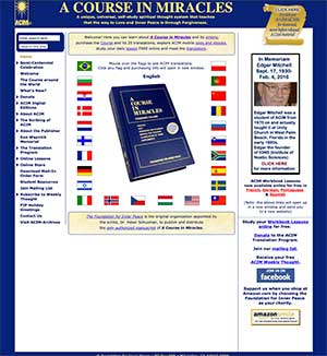
- Old Site
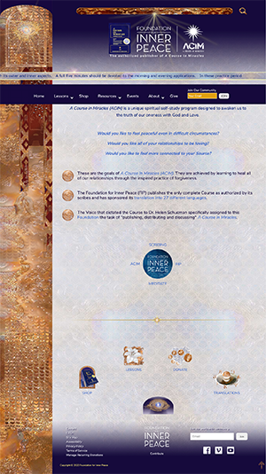
- New site
Visual/Graphic Design:
The complex design required numerous iterations and extensive multiple edits to the text and styling of most of the hundreds of existing pages and posts. This ensured mobile-responsive performance across a wide range of screen widths and devices, with dozens of custom-crafted visual style (CSS) definitions unique to this website. The standard Genesis (Lifestyle) child theme was completely transformed and – as of the time of this writing – has 5700 lines of CSS code. The fine-tuning of the design to optimize both performance and appearance when it was launched in Nov. 2018 took meticulous care, patient persistence and reflects a dedication to long term commitment and communication with the client. We broke ground on numerous new ideas and extended many of the elements and components used beyond their originally envisioned functions and concepts.
Performance Considerations:
Because of the large amount of existing traffic from the legacy site’s visitors, representing millions of customers from the publisher’s multi-decade history reaching back to the mid-1970s, premium hosting was needed. We, therefore, chose WP Engine after carefully considering several high-end hosting options. This decision also initiated choosing G Suite for Non-Profits as the new email solution for the client. Many of the hundreds of online video screen-sharing meetings we’ve had for this project were to learn together and bring the expertise of our clients to a new level of capability while expanding our own toolset. This was assisted by numerous chat and support hours with hosting providers, plugin authors, and various online service providers.
Ongoing Updates and Maintenance:
Since November 2018, we have continued to provide daily (in many cases), weekly and monthly updates, to the site and other social media assets including dozens of related Facebook pages. We continue to expand both visual and text content to maintain and grow visitor engagement and extend the searchable base of excellent material the site presents. The new site incorporates two other prior sites – a sizable archive site and another with video interviews from many of the translators of 27 different language editions. The next phase (re-branding, another quantum jump in expanded content, likely to include deeper multi-site and social media integration) promises to further enhance this non-profit’s global reach and effectiveness. We’re poised and enthused to deliver what’s next!


